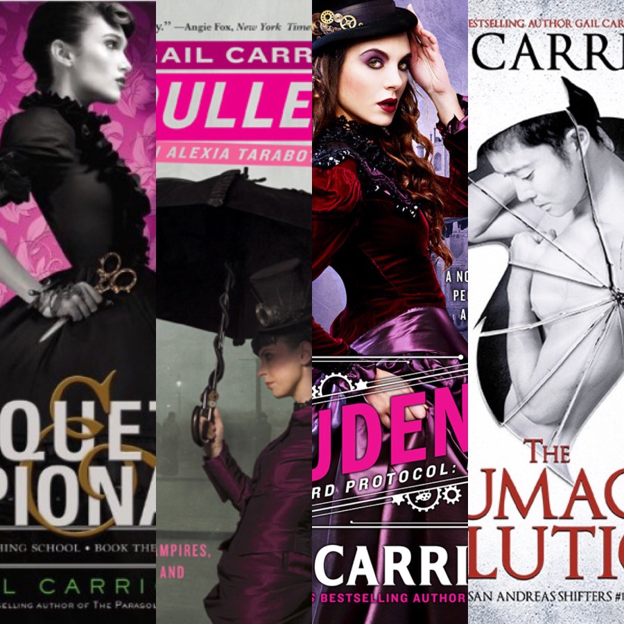
I am a big fan of Gail Carriger’s Parasol Protectorate, Custard Protocol series and her YA series The Finishing School. I have reviewed a few of her books and occassionally read her newsletters to keep up with what she has coming out and is working on. Lo and Behold, tonight I read this fabulous article about why or really what cover art should say about what is in your novel. I totally agree with the importance of portraying what’s inside the book correctly. I think I have mentioned this a time or two… It’s fascinating to hear from the authors viewpoint. She also talks about her slight change in pen name when she writes from genre to genre. Her reasons make total sense when writing a clean YA, steampuk, to a raunchier adult, LGBTQ novel.
Anyways, you can read the article yourself because I have pasted it below.
If you read to the very bottom you will see a quote from THE READING CHICK ( yes ME!) from a review I wrote for Prudence. Color me shocked when I saw that! And VERY pleased!
So please enjoy Ms. Carrigers thoughts, she is a super talented writer, well spoken, and really knows what she’s talking about.
Deb (The Reading Chick)
.


That was so interesting to read- and it made a lot of sense, since I’ve seen other authors do the same thing before. Great review!
LikeLiked by 1 person
Sorry I meant thank you for sharing- sometimes my brain doesn’t work properly 😉
LikeLiked by 1 person
I really just wanted to share her article. When a book cover doesn’t match the story inside it drives me nuts! It’s interesting to see the thought process that goes into the cover as well as the pen names…
LikeLiked by 1 person
Yes I completely understand that and I agree!! It drives me crazy, cos it feels like I’ve been miss-sold something So this was very interesting.
LikeLiked by 1 person